Money And Markets Update: Three Peaks And A Domed House On The Value Line Index?
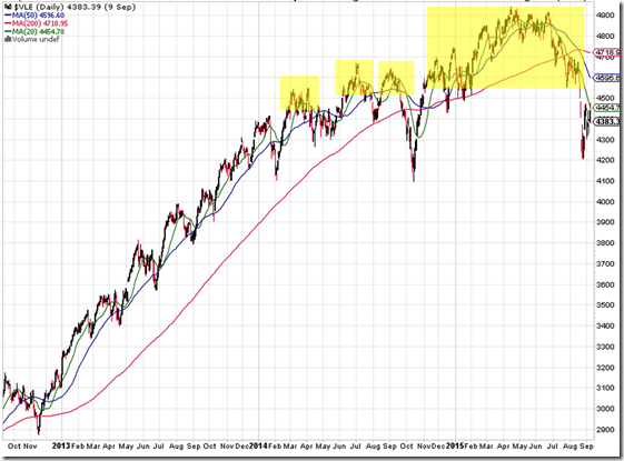
Value Line Index – click on image for a larger view
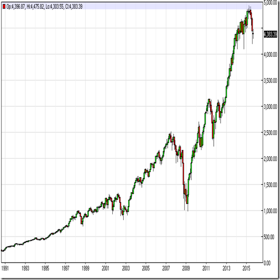
Vale Line Index Domed House – click on image for a larger view
Link to daily updated Value Line Index chart #1
Link to daily updated Value Line Index chart #2
As usual, an introductory paragraph of general thoughts for the day. Isn’t it obvious by now that no one in the system has any clue what’s going on? The system’s “experts” keep telling us everything will be okay or will stabilize or be contained. Most recently the Chinese prime minister told the world that they will not have a hard landing. And that the communists have methods of ensuring that doesn’t happen. Bahaha!!! You mean like the Soviet Union? The ignorance and arrogance of that statement is palpable. What else is a bureaucrat to say? I was flicking through the channels about a year ago and I came across the Anthony Bourdain traveling food show. He was in China so I watched a little of it. I remember one point from that show. (paraphrasing) One of the guests, who was Chinese, told him that the future was incredibly bright. That around 90% of people in China believed their prosperity in coming years would only increase. How’s that working out for you? Given society, especially communist Chinese society, is the Borg, that statement should be very telling. The universe has a long way to go in shattering that delusional belief system. All of these experts tell us everything will be okay but none of them ever anticipate anything that ever happens. Well, other than everything will be okay when something blows up in their face.
Above are two charts of the Value Line Index. I thought I would throw this up before the remainder of my financial market updates because of the timeliness and urgency of markets. As I’ve noted before, I have shut down my trading system. It was just too expensive to maintain unless I was using it to make money. And as noted on here mid last year, I am out of financial markets. Likely forever. So, I don’t have access to any of my algorithms anymore. That is mainly why I am out of the intermediate term and shorter term forecasting business. I don’t have the data to accurately or intelligently remark of markets unless I am using generally available analysis like government data or the charts above. But I do want to share a pretty big secret hidden in plain sight that will give anyone who is still in the casino the ability to make some pretty accurate and intelligent decisions. What am I talking about? The Value Line Index.
Value Line is a lost name in the financial world. It’s a company that has been around nearly one hundred years but you never see it mentioned anywhere anymore. When I was a kid I remember sending away for these massive binders they would sell at introductory prices. They were stuffed with enormous amounts of data and information about stocks. Value Line was an incredible gem at that time. With the rise of the internet in the last 15 years or so, I really don’t know what Value Line offers. But I’m sure it’s even more voluminous.
One of the gems of Value Line is a nearly anonymous index called the Value Line Index. People who have been in financial markets more than the last fifteen years or so, and who are savvy market sages will clearly recognize the name of Value Line as a leader in market research. The Value Line Index is an equally weighted index of about 1,600 high quality companies in the U.S. (I have provided permanent links to the index that you can save into your browser bookmarks if you like.) But what is unique about the Index is that it is equally weighted and comprised only of high quality stocks. In the last twenty years Wall Street has brought forth so many useless trading products, derivatives, ETFs, bonds trading as stocks, companies that shouldn’t be traded publicly and the like. Obviously, all to feed the profit beast. So, the Value Line Index is really a unique look at the overall health of markets as it whittles away all of the junk and noise that has become the major stock exchanges. The Index also serves as a perfect cumulative advance-decline line given all of the companies in the index are equally-weighted. So, the index will only move higher if the majority of company stocks are moving higher, regardless of their size. Within the Index, a small company is weighted equally with the largest company. Simply by looking at the trend of the index, you can tell if more high quality stocks are rising or falling. Included on the charts are 200, 50 and 20 day moving averages to get a better visual of the trend. The legend of which is what color is in the upper left corner of the charts.
This is pretty important because all of the advance-decline lines generally available are junk. They include so many things other than high quality stocks. ie, ETFs, bonds trading as stocks, ETNs and the like. I created and programmed my own advance-decline data because of this. And that is why I noted on here some years ago when everyone was saying that we were getting all of these Hindenburg Omens, that they were wrong. The Hindenburg Omen was a rip-off of Norman Fosback’s work and he did not calculate his work using the flawed metrics that people use today in Hindenburg Omen calculations. My point is that the Value Line Index works better than the NYSE or Nasdaq advance-decline lines and is a very powerful tool.
In the first chart I have highlighted in yellow what looks very much like a Three Peaks and a Domed House pattern. I haven’t applied that term to any indices in the U.S. since leading into the 2008 collapse. There is a very technical interpretation of that pattern that tries to lay out dozens of points but it’s a lot of drivel. But, the pattern itself is a repeated pattern. ie, Markets start to top and form smaller peaks, in this case three. Then, as a last bit of hubris hits buyers at the very end of trend, there is one final exhaustion push higher in a rounded or Domed House that then leads into eventual collapse. Is that where we are today in the Value Line Index? Well, that’s for you to decide. But, I bring it up for a reason. With liquidity around the world evaporating at such an incredible, and literally unprecedented clip, this has all of the makings of a massive top.
On a shorter term basis, you can see from the close up on the second chart that the 20 day moving average or 20 day price trend is pointing straight down. And the 50 day or 2.5 month moving average or price trend is barreling right behind. Draw your own conclusions. (Moving averages help you better see trends)
The Value Line Index uniquely gives the health of markets in an environment like we have been in the for the last two decades or so. That is, when derivatives, program trading and massive market liquidity allows Wall Street and major hedge funds to buy the entire market through the proverbial push of a button. ie, Computer trading. Historically, the Value Line Index may not provide such a clear picture of market health. Certain sectors may be in vogue. And markets could levitate or go higher without the majority of stocks going with them. (Those are long lost days when stock pickers and fundamental analysis actually mattered.) But with everything either going up or going down, as it does in this liquidity bubble and computer trading that it allows, the Index is the perfect barometer for those without a lot of quantitative and qualitative knowledge of markets. By the way, all of this computer trading in the world today is going to fail. All of it. I’ll put up a post on why quantitative finance must mathematically fail at some point. But it’s coming. Guaranteed. And just as I have noted many times, the only thing that will save you in a quantitative finance bubble is qualitative understanding of what is going on. That means a fundamentals-based view of markets. That doesn’t exist almost anywhere anymore. The world, especially in finance and economics, has gone full bore retard. No one knows how to read a balance sheet, an income statement, an earnings statement or, more importantly, all of the footnotes aka lies that we are being told in today’s dystopian world. No one in the financial, political or economics Borg really has any idea what is happening or how profound this moment is.
In closing, just for giggles, well, and for the horror effect, below is a 25 year chart of the Value Line Index. Horror because, as I have noted ad nauseam on here, the U.S. economy peaked around 1975-80-ish. (Large details on that eventually) You get a longer term perspective on the Three Peaks and a Domed House pattern in the chart below. On this monthly chart, the index has clearly made a major breakdown. Will it be temporary? Will central banks and politicians find a way to overcome evaporating liquidity in the biggest financial bubble the world has ever seen? Well, I guess that depends on if you believe in saviors. The world apparently does because we’ve all give our masters unprecedented power over our lives. And look what they have done with it.
By the way, the Value Line index has made a lower low on the second chart above. If it fails to overcome that and make a new higher high, personally, if I had money in markets, I’d make sure to stock up on as many boxes of diapers as I could find. Because the next stop down is probably around 3,000 on the index as shown on the third chart below. Ultimately, I would expect the Value Line Index to break the 2002 and 2008 lows. Just sayin.


<< Home